
Wandering Watercolours Author/Artist Garry Hamilton
gives some tips for painters using photo reference
The Members Choice Challenge date has been revised to Nov. 29 allowing more painting time to create a painting from photo reference.
Here are some tips I hope you will find useful.
A photo can be cropped, flopped or re-arranged for design purposes. ( unless it is a known landmark, where judgement is required )
Photo Reference & How To Use It
Bad weather, compromised mobility, time limits, a moving image.
Sometimes the best option for a painter is photo reference.
What photo reference is and what it isn’t.
It isn’t an image for a painter to thoughtlessly copy.
It is a tool to be used to create something new, something from your own vision, extracting, editing, discarding, inventing.
The Process
Visualize cropping the photo. If necessary use strips of mat paper to visualize and compose the best layout.
Sketch your small design plan rough in a sketch pad. 4B pencil works well. Just tonal shapes, no careful rendering. It is a tool, not a work of art.
Decisions
Where will your centre of interest be?
How will you direct a viewer’s eye to it?
Tonal contrasts? Directional lines? Opposite colour juxtaposition?
Decide on your painting approach.
This will include
Eye level, ( horizon line ) above or below halfway up.
Sequence of washes,
Colour choices with either warm or cool dominance,
Brush treatment, wet in wet, wet on dry, dry brush.
Stop painting when you have nothing new to add that will improve the painting.
Evolution
Here is the good news.
Your vision will evolve as you paint. Fresh insights will emerge.
In watercolour, especially in wet in wet, watercolour speaks to you.
There is a reason they are called Happy Accidents.
Do not fuss or overwork. Consider each brush stroke before applying it, Then do it once, decisively.
If time is flying by, you are in the zone and all is right in the world.
If the painting didn’t work out, you still win, because you learned why it didn’t work and are now more prepared to do it again. Only better.
Attached are some alternative crops. I think all 3 photos can work.
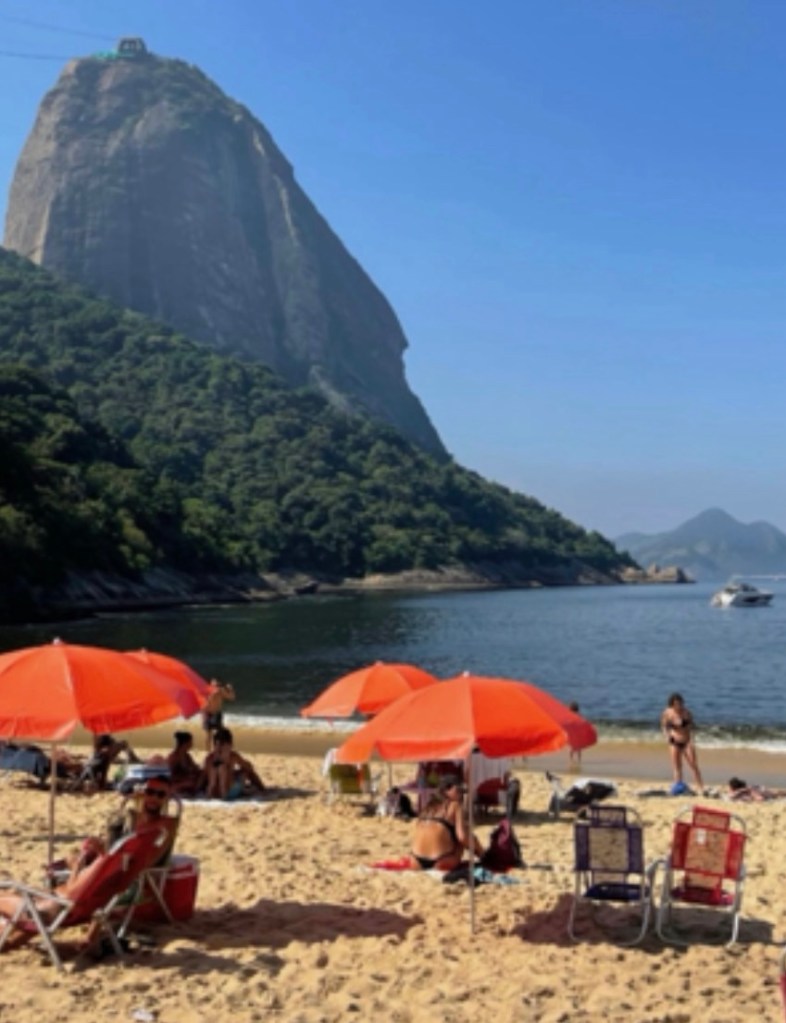
Reference photo. I suggest one continuous pattern shape for umbrellas.
If foreground figure is kept she should face water
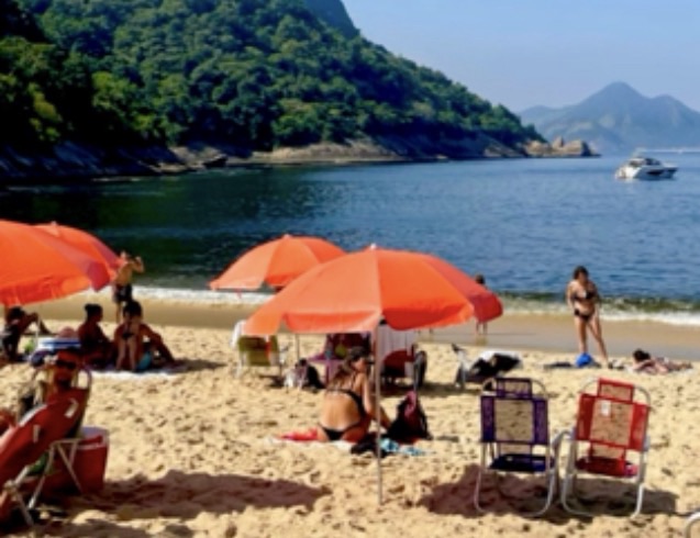
One alternative Same critique as uncropped.
Maybe lose boat, play up waves
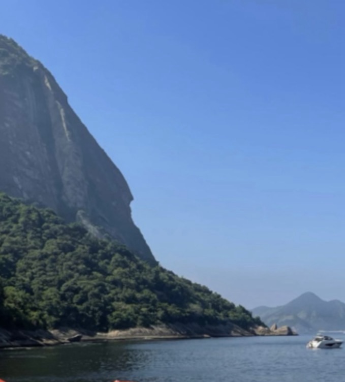
Another alternative
Here is another take on this layout. I don’t mean it as a formula for others, but as an example of one approach.
In this cropped photo, my changes would be,
move boat more towards centre bow facing in.
Make it a sailboat with high mast ( a vertical direction countering the horizontals and obliques ), play up textures in water, foliage and rocky shore, Including mountain shadow in the water left lower quadrant.
Introduce birds wherever it works best for design balance.
*note I always get new insights as my own painting progresses and the suggestions I originally made will probably evolve as will yours.
Good luck and happy painting.
Cheers, Garry

